NAVIGATION MENU
NAVIGATION BAR
- A set of buttons in a row or column that serves as a control point to link user to the other sections on the website.
- The navigation bar can be divided into two types, namely Horizontal Menu Bar and Vertical Menu Bar.
HORIZONTAL MENU BAR
- This type of menu bar can usually be seen in the widest 1200 breakpoint and set to be hidden in the other breakpoints. However, depending on the page design, it can also be used on other breakpoints, for example Template 14 that uses the horizontal bar in the 1050 breakpoint.
- The menu bar is created from the Muse native horizontal menu widget.
- On some templates, the menu bar has been placed inside a State Button powered with the additional CSS and JavaScript for more function and interactivity.

Reveal Sub Menu
- Some menu buttons may contain another set of sub-menu buttons. (Refer at Template 14).
- To reveal these buttons, click twice on the main navigation button.

Click the Main Button Twice
to Reveal the Sub-Menu Buttons
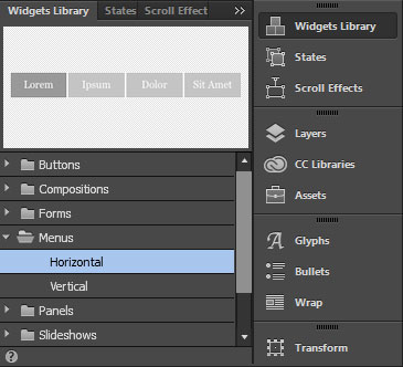
VERTICAL MENU BAR
- Some templates use a side-bar type of navigation on the widest 1200 breakpoint that utilizes the vertical menu bar. Examples of this implementation can be seen in Template 06 & 13.
- In Tersus template the vertical menu bar is mostly used in the 1050, 800, 670, 450 and 380 breakpoints as a side menu and set to be hidden in the 1200 breakpoint. Example Template 01, 02 & 03.
- The menu bar below is created from the Muse Vertical Menu widget.
- The menu widget can be placed inside a State Button powered with the additional CSS and JavaScript to create the side sliding menu composition.


Reveal Sub Menu
- Some menu buttons may contain another set of sub-menu buttons. (Refer at Template 14).
- The sub-menu in the vertical menu is created with the composition widget.
- To reveal these buttons, open the options panel and tick on the show lightbox parts while editing checkbox.
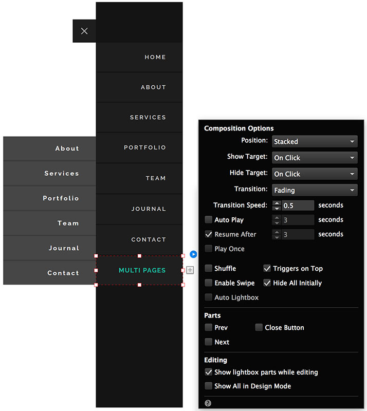
Tick This Checkbox
CUSTOM MENU COMPOSITIONS
There are several type of custom menu compositions available in Tersus. To create this unique compositions, an advance workaround that combine local Muse elements with the additional JavaScript and CSS has been implemented.
CUSTOM TOP SLIDE MENU COMPOSITION WITH ADDITIONAL JAVASCRIPT & CSS
VIEW DEMO
*Click button to view the demo page

Menu Widget inside the State Button.
The buttons have been assigned with the style
( menuTopSlideButton )
State Button container box that holds the
menu widget and other objects like the logo
When the Hamburger Icon is clicked, this box will slide down
( menuTopSlideNav )
Rectangle for background
( menuTopSlideNavBG )
Hamburger Icon Button to show and hide the menu composition
( menuTopSlideNav-Btn )
CUSTOM SIDE SLIDE MENU COMPOSITION WITH ADDITIONAL JAVASCRIPT & CSS
VIEW DEMO
*Click button to view the demo page
Hamburger Icon Button to show the menu composition
( menuSideSlideNav-Btn )
Close Button to hide the menu composition
( menuSideSlideNav-Close )
State Button container box that holds the menu widget.
When the Hamburger Icon is clicked, this box will slide to reveal the menu compostion
( menuSideSlideNavLeft / menuSideSlideNavLeft )
Rectangle for background
( menuSideSlideNavBG )
Menu Widget inside the State Button.
The buttons have been assigned with the style
( menuSideSlideButton )

SCROLLABLE BOX FOR SIDE MENU
On smaller screen with a shorter viewport height, a custom scrollable box created by integrating Muse with the additional CSS has been added. This is to make sure that overflow content can be seen by scrolling the box up and down.
Scrollable Box
Implementation
- From the image below, the container box that holds the menu widget is assigned with a graphic style called menuScrollBox.
- The style is linked to a function that will convert the box to a scrollable box with a scroll bar when the viewport height is shorter than the menu widget height.

Placed Inside
Placed Inside
=
The Complete Composition, Which is a Combination of Several Elements
Menu Widget
State Button Container Box. The Main Container and Outermost Element in the Composition
State Button Container Box that Holds the Menu Widget
This is the Scrollable Box
Graphic Style
( menuScrollBox )
- Apart from the graphic style, a short styling code is also added to the Master Page's Page Properties Metadata Box.
- A certain value in the the styling code can be edited to optimize the scrollable box.

Styling Code to Optimize the Scrollable Box
Optimizing the Scrollable Box for Different Height of Menu Widget
For the best result, in the styling code, set the height value to be about 100px more than the height of the menu widget.
For example, if the menu widget's height is 450px, then the value that is best put in the styling code is 550px.

If Menu Widget Height is 450px,
Height Value in the Styling Should be Best Put as 550px
"<style> .menuScrollContent { height: 550px; } </style>"
Advance Optimization for the Scrollable Box
- If the height of the menu widget is different in every breakpoint, advance styling code is needed to better optimize the scrollable box.
- In this case, please replace the simple styling code in the metadata box with with the code below.
- This more advance code will enable user to assign different box height for each breakpoint.
"
<style>
@media screen and (max-width: 1050px) { .menuScrollContent { height: 550px; }
@media screen and (max-width: 800px) { .menuScrollContent { height: 500px; }
@media screen and (max-width: 670px) { .menuScrollContent { height: 450px; }
@media screen and (max-width: 450px) { .menuScrollContent { height: 420px; }
@media screen and (max-width: 380px) { .menuScrollContent { height: 4000px; }
</style>
"
TOP AND SIDE SLIDE MENU ‘HIDE ON SCROLL’ FUNCTION
This is a function that tells the slide menu to hide or slide back to its original position when the page is scrolled down.
Implementation
- The State Button container box that holds the menu widget has been assigned with the Graphic Styles 'menuTopSlideNav', 'menuSideSlideNavLeft' or 'menuSideSlideNavRight' respectively, depending on which type of custom menu composition that is used on the particular page.
- These Graphic Styles have been linked with a JavaScript function in tersus.js that tells the slide menu to hide or slide back to its original position when the page is scrolled down.
How to Remove the Function
- By default, this function will affect all sliding-type custom menu composition. However, the function can be removed if it is not required.
- To remove the function, the tersus.js file will need to be edited.
- In the Assets folder, open the tersus.js file and look for the script function called 'Hide Slide Menu on Scroll'.
- Delete all lines shown in the image below to remove the function.

TOP MENU BAR SLIDE DOWN & UP ON SCROLL
Some menu compositions come with a top bar background that is initially hidden when the page is displayed, and will slide down when the page is scrolled down. This is to give a distinctive contrast between the menu elements and the page content so that they are always visible.
VIEW DEMO
*Click button to view the demo page
Implementation
- To create the effects, the black top bar has been assigned with the graphic style, 'slideInScroll'.

Menu bar background has been assigned with the style
( slideInScroll )
All content © Tersus, 2019. All rights reserved.