EDITING GUIDE FOR VARIOUS COMPOSITIONS & WIDGETS
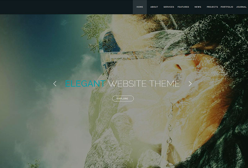
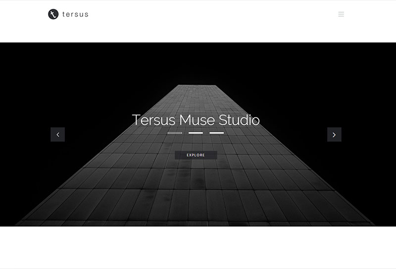
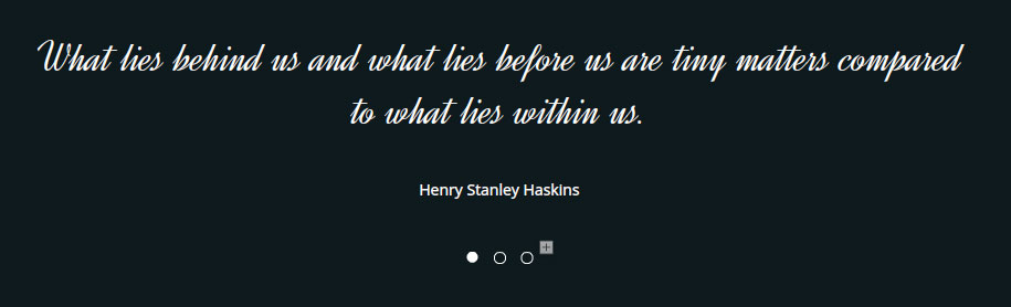
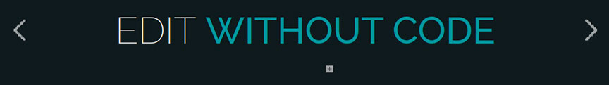
HOMEPAGE SLIDER
- A big slideshow widget that displays a presentation of a series of still images.
- This type of slideshow is usually placed at the top area of the Home section, which is the first page of the website.
DESIGN VARIATIONS
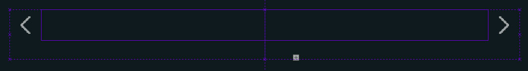
NAVIGATE BETWEEN SLIDE CONTAINERS
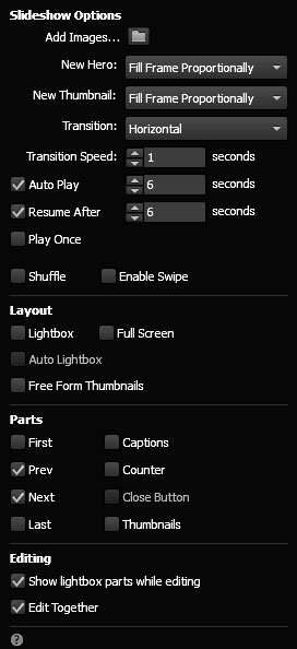
- To navigate between images in the slider, make sure that in the widget options panel, the Prev and Next checkboxes are ticked to display the buttons. On some designs, these buttons are by default set to be displayed. If the buttons are not seen, the setting can be changed in the panel.
- NOTE. Some Text Slider widgets with their own Prev and Next buttons are positioned on top of the homepage slider. These buttons are not connected to the homepage slider and are only meant to be used for the text slider widget.
Prev Button
Next Button
Prev and Next Buttons
Prev & Next Button
in the Options Panel
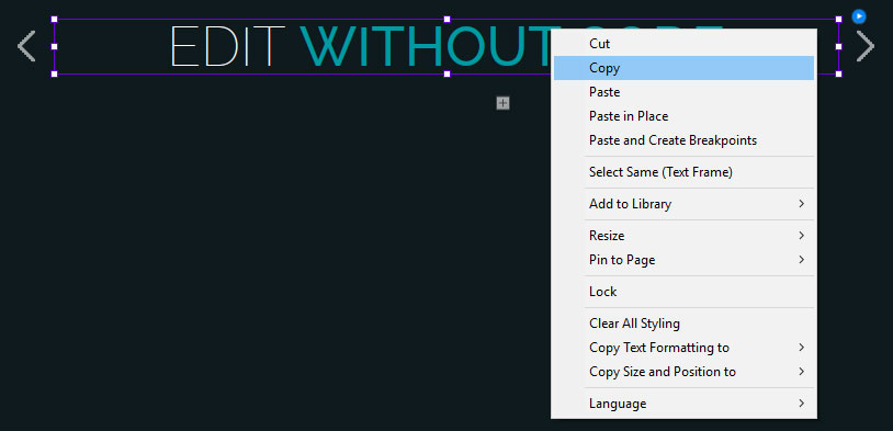
CLEAR SAMPLE IMAGES
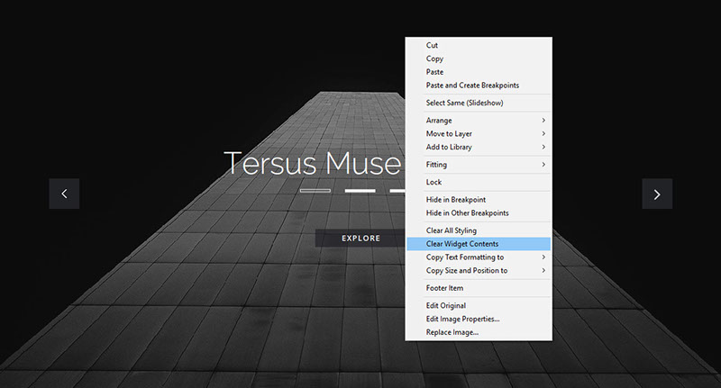
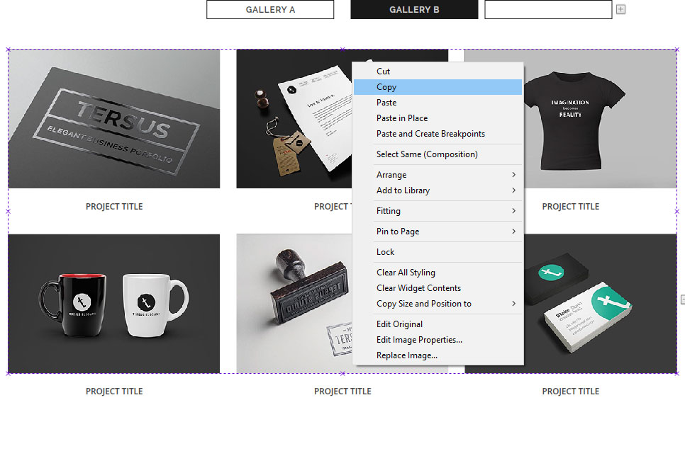
- To clear the pre-included sample images, select and right click the widget and in the menu panel choose Clear Widget Contents.
- NOTE. Some slider widgets are placed under a semi transparent rectangle. Before the slider can be selected, this rectangle has to be locked first.
Clear Widget Content
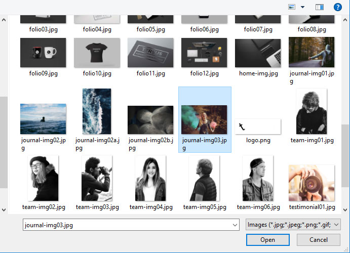
ADD NEW IMAGES
- To add new set of images to the slider, open the widget options panel and click the Add Images button.
- In the folder dialog box, select the new set of images and click the Open button to add them to the slider.
Add Images Button
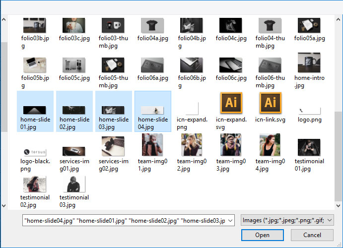
Select New Images
HOMEPAGE VIDEO
- A custom top, full-width video widget has been included in the package.
- Video and image poster can be added from the widget options panel.
- Instructions are available in the options panel to help and guide you to use the widget.
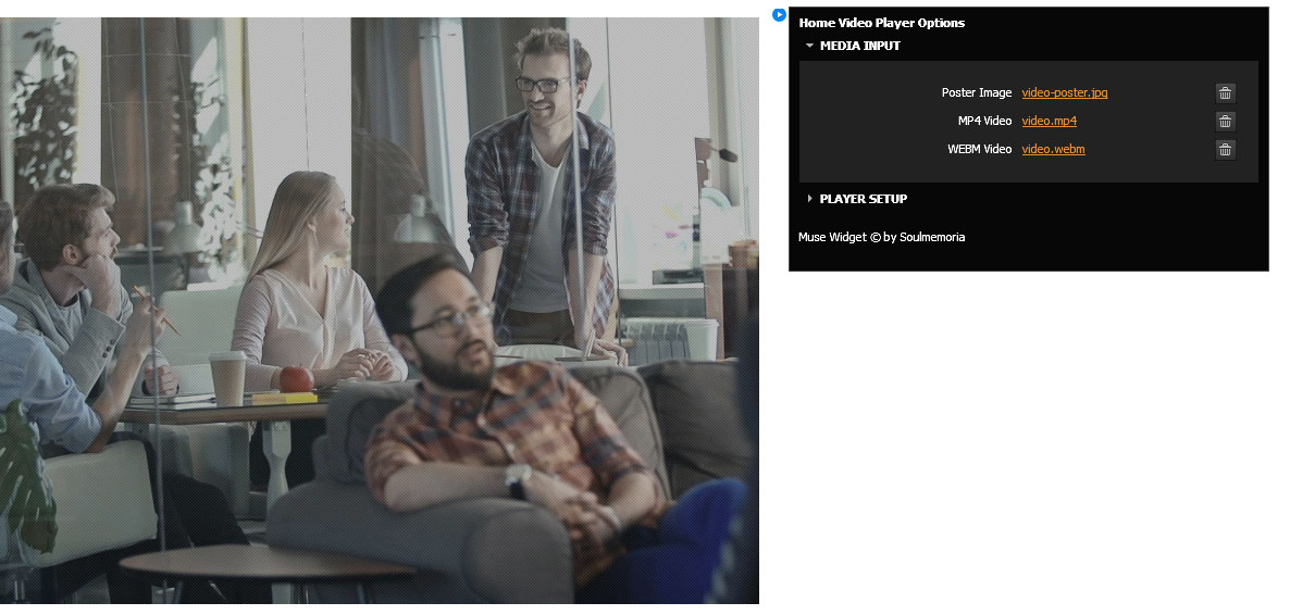
REQUIRED MEDIA FILES
-
For the video to works on multiple browsers, 3 media files will be used:
- Optimized MP4 video file with a frame size of 1920 x 1080 or 1280 x 720.
- Optimized WEBM video file that can be created by converting the MP4 video. There are a lot of free online converter that can execute this task.
- JPG image file with a frame size of 1920 x 1080. This is the image that will be displayed while the video is loading.
- In Tersus, these files have been placed inside the Assets folder.
- IMPORTANT. To make sure that the video file will load without a significant delay, make sure that the media files are optimized with the best ratio of file size vs quality.
TEXT SLIDER
- A slideshow widget that displays a presentation of a series of text frames.
DESIGN VARIATIONS
NAVIGATE BETWEEN SLIDE CONTAINERS
- There are two methods of navigating between slide containers in the slider.
- The first method is by using the the Prev and Next button, and the second method is by using the Trigger buttons.
Prev Button
Next Button
Trigger Buttons
ADD NEW SLIDE CONTAINER
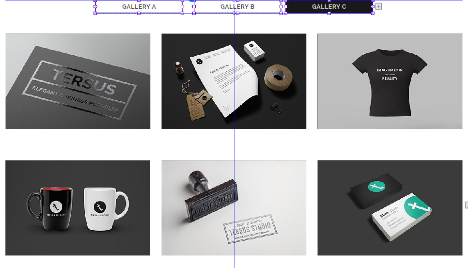
- To add new slide container, navigate to the last container, then click on the plus ‘+’ button.
- TIP. The plus ‘+’ button can be hard to click if no element is selected. During this step, make sure that a navigation button is selected. Navigation buttons are the Prev and Next buttons or the Trigger buttons.
Plus Button
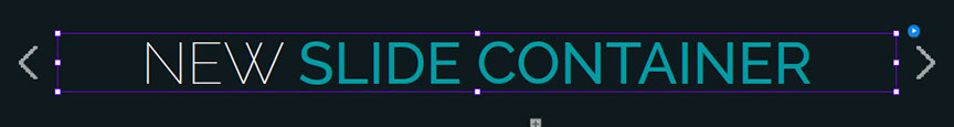
- A new blank slide container will be created.
New Slide Container
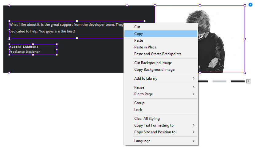
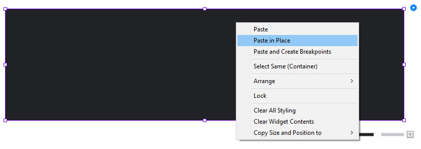
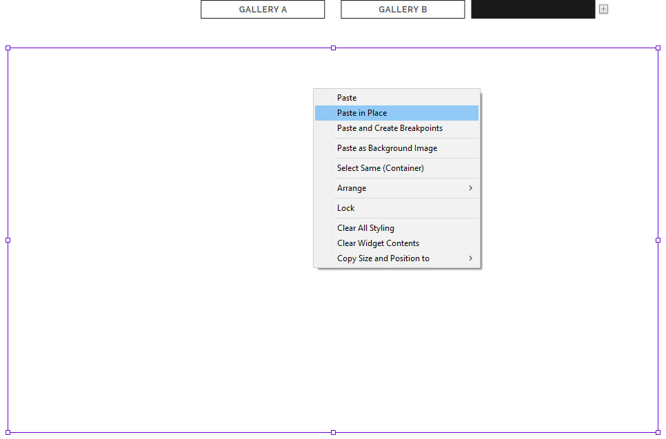
- To add a text frame to the new slide container, go back to the previous container and Copy the existing text frame.
- Then go back to the new container and use the Paste in Place command the paste the text frame inside the newly created slide container.
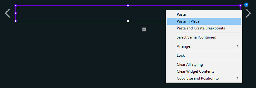
- Edit the text in the text frame.
MIX MEDIA SLIDER
- A slideshow widget that displays a presentation of a series of mix media elements such text frames and images and also other type of media.
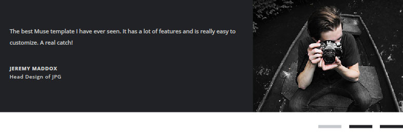
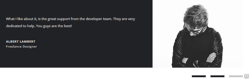
- This type of widget is usually utilized to create the presentation widget for the Client's Testimonial, Client Logos and also some Team Profile sections.
DESIGN VARIATIONS
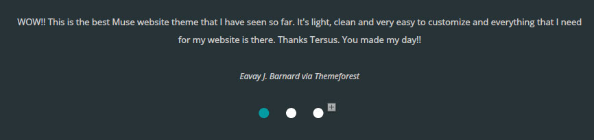
Client Testimonial Slide Presentation
Client Testimonial Slide Presentation
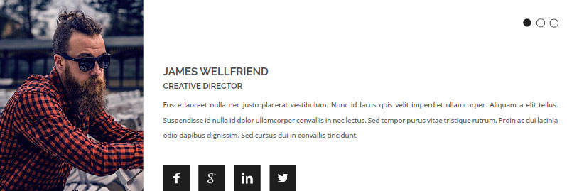
Team Profile Slide Presentation
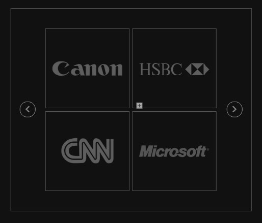
Client Logos Slide Presentation
Client Logos Slide Presentation
NAVIGATE BETWEEN SLIDE CONTAINERS
- There are two methods of navigating between slide containers in the slider.
- The first method is by using the the Prev and Next button, and the second method is by using the Trigger buttons.
Prev Button
Next Button
Trigger Buttons
ADD NEW SLIDE CONTAINER
- To add new slide container, navigate to the last container, then click on the plus ‘+’ button.
- TIP. The plus ‘+’ button can be hard to click if no element is selected. During this step, make sure that a navigation button is selected. Navigation buttons are the Prev and Next buttons or the Trigger buttons.
Plus Button
- A new blank slide container will be created.
New Slide Container
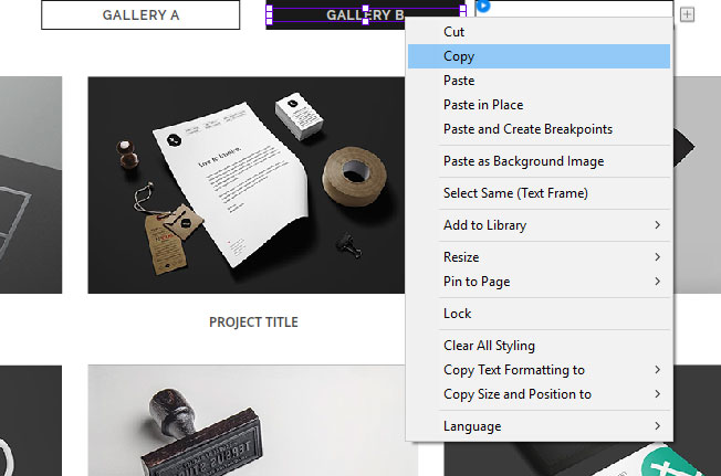
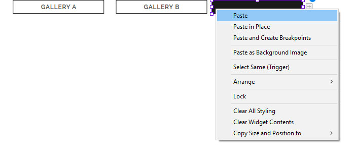
- To add media elements to the new slide container, go back to the previous container select all elements and Copy the existing elements.
- IMPORTANT. New media elements prepared from scratch can be added to the blank slide container. However, since the new elements have not been optimized for responsive layout, this process has to be done delicately and with consideration of how it will affect the other breakpoints. This is to make sure that the slide container design in the other breakpoints is not broken.
- Then go back to the new container and use the Paste in Place command to the paste the elements inside the newly created slide container.
TAB PANEL
- A widget that represents a tabbed set of content pages or containers.
- Each page can be revealed by selecting the trigger button associated with that page.
- The container can be filled in with elements such as another composition widget like a portfolio gallery, mix media elements like text frames, images and embed HTML object and also other type of elements.
- This type of composition is usually utilized to create the widget for the selection tab panel for Portfolio section and also other informational presentation type of widgets.
DESIGN VARIATIONS
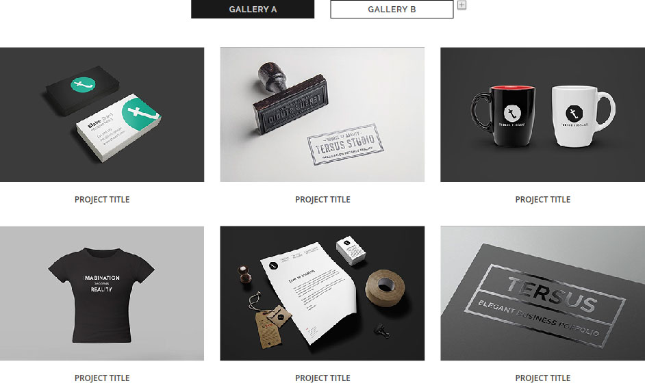
Selection Tab Panel for Portfolio Section
informational Presentation with Tab Panel

informational Presentation with Tab Panel
NAVIGATE BETWEEN PANEL CONTAINERS
- Use the trigger buttons to navigate between the panel containers.
- NOTE. Panel Container is also known as Target Frame.
Trigger Buttons
Panel Container /
Target Frame
ADD NEW TRIGGER BUTTON & PANEL CONTAINER
- To add new trigger button and panel container, navigate to the last trigger button, then click on the plus ‘+’ button.
- TIP. The plus ‘+’ button can be hard to click if no element is selected. During this step, make sure that the last trigger button is selected.
Plus Button
- A new blank trigger button and panel container will be created.
New Panel Container
New Trigger Button
- Go back to the previous trigger button and Copy the existing title text frame from the button.
- Paste the text frame inside the new trigger button.
- To add media elements to the new panel container, go back to the previous container and Copy either the widget or other media elements from the container.
- IMPORTANT. New widgets or media elements prepared from scratch can be added to the blank panel container. However, since the new elements have not been optimized for responsive layout, this process has to be done delicately and with consideration of how it will affect the other breakpoints. This is to make sure that the tab panel design in the other breakpoints is not broken.
- Use the Paste in Place command to paste the element inside the newly created panel container.
- Finally arrange the trigger buttons position accordingly.
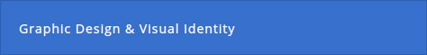
ACCORDION PANEL
- A widget with a vertically stacked list of items.
- Each item is represented with a label button or thumbnail that can be expanded to reveal the content associated with that item.
- The container can be filled in with elements such as text frames, images, embed HTML object and also other various type of elements and widgets.
- This type of composition is usually utilized to create the widget for informational presentation type of widgets.
DESIGN VARIATIONS
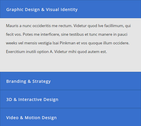
Informational Text Presentation with Accordian Widget
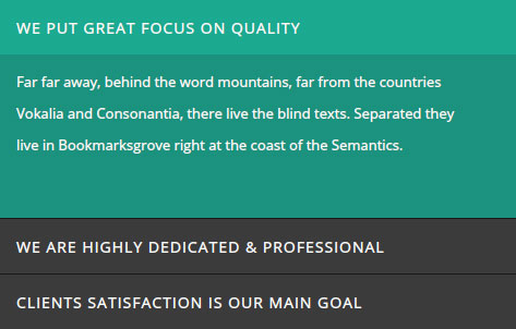
Informational Text Presentation with Accordian Widget
Mix Media Content Presentation with Accordian Widget
LABELS / THUMBNAIL VARIATIONS
TYPE 01 - Simple Label with Text Frame
- A simple label button with text as the title.
- The text can be directly typed inside the label button.
Text Title in Label Button
- The label button share the same characteristic with a text frame. Therefore the attributes can be set in the Text panel.
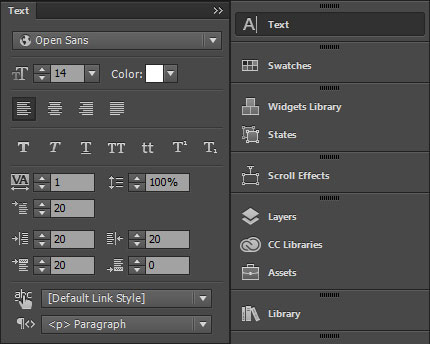
Text Panel
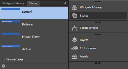
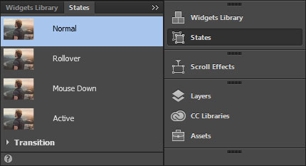
- When the label button is selected, in the States panel the Active state will be by default activated.
- During the label editing process, make sure that the right state is selected depending on the type of result that need to achieved.
- Usually when the text attributes need to be changed, the best way to do that is by editing from the Normal state.
- Therefore, make sure that the Normal state is selected before changes is applied to the text attributes. From there check and edit the text attributes downward in the other states accordingly.
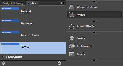
Active State
Normal State
TYPE 02 - Thumbnail with Text Frame and Image
- Thumbnail with image and text frames.
- To make it possible to insert object like images an another text frames inside the label box, first a State Button has to be placed inside the box. The other objects will be then placed insdie the State Button.
- IMPORTANT. New objects prepared from scratch can be added to the State Button inside the label box. However, since the new objects have not been optimized for responsive layout, this process has to be done delicately and with consideration of how it will affect the other breakpoints. This is to make sure that the accordion panel design in the other breakpoints is not broken.
State Button Inside the
Label Box
Objects Inside the State Button
NAVIGATE BETWEEN PANEL CONTAINERS
- Use the labels button or thumbnail to navigate between the panel containers.
- NOTE. Panel Container is also known as Content Area.
Label Buttons / Thumbnail
Panel Container / Content Area
Panel Container / Content Area
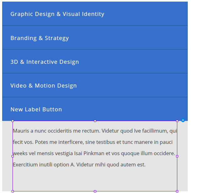
ADD NEW LABEL BUTTON & PANEL CONTAINER
- To add new label button and panel container, navigate to the most bottom content and select either the label button or the content area box, then click on the plus ‘+’ button.
- TIP. The plus ‘+’ button can be hard to click if no element is selected. During this step, make sure that the label button or the content area box is selected.
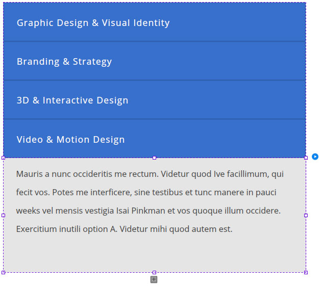
Plus Button
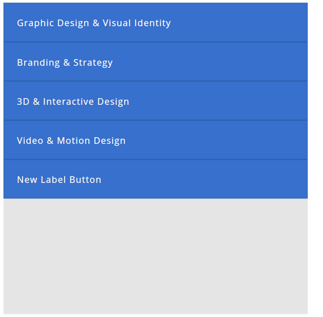
- A new blank label button and panel container will be created.
New Label Button
New Panel Container / Content Area
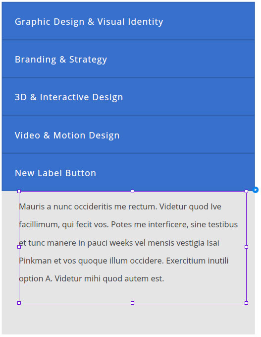
- To add media element to the new panel container, go back to any of the top container with exisitng element and Copy the element from the container.
- IMPORTANT. New widgets or media elements prepared from scratch can be added to the blank panel container. However, since the new elements have not been optimized for responsive layout, this process has to be done delicately and with consideration of how it will affect the other breakpoints. This is to make sure that the tab panel design in the other breakpoints is not broken.
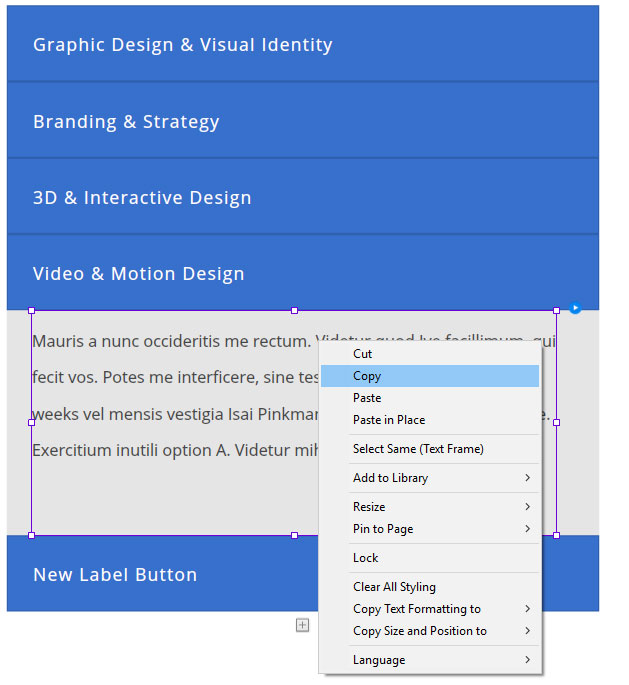
- Paste the element (text frame in the example below) inside the new panel container.
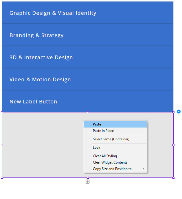
Paste Element
- IMPORTANT. In the other breakpoints, the position of the element will usually be slightly off about 10 pixel to the right and also sometimes 10 pixel to the bottom.
- The position of this element in the other breakpoints will need to be arranged manually.
Element's position is 10 pixels off to the right.
Arrange the element's position accordingly.
REVEAL ON CLICK OR ROLLOVER WIDGET
- A widget that reveals hidden content on mouse click or rollover.
- This type of widget is usually utilized to create the presentation widget for the Team Profile sections and other informational presentation type of widgets.
DESIGN VARIATIONS

Normal State
On Click
Normal State
On Rollover
Normal State
On Rollover
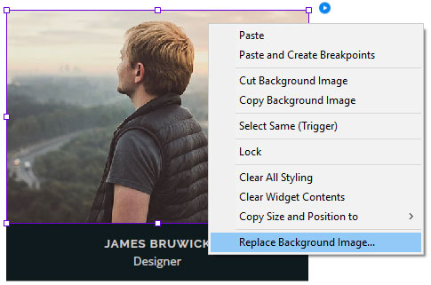
REPLACE THUMBNAIL IMAGE
- Click on the box with the image. This can also be called as the Image Container.
- Inside the Image Container, right click and select Replace Background Image to change the image.
- During this process, in States, make sure that the Normal state is selected, or else only the Active state image will be changed.
REVEAL HIDDEN CONTENT
- To reveal the hidden content, select the button or thumbnail and open the options panel.
- In the panel, tick the show lightbox parts while editing checkbox.
Tick This Checkbox
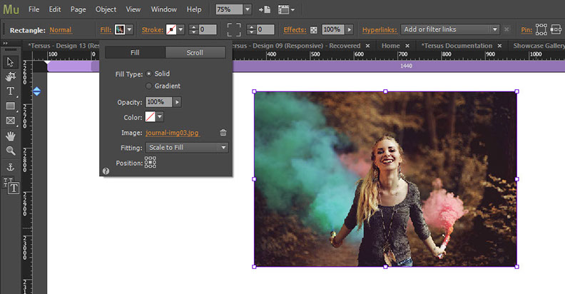
ADD & REPLACE IMAGE INSIDE A RECTANGLE
- The Rectangle Tool is extensively used as placement object for image.
- Image with a particular size be might be displayed in different sizes and proportions in several different breakpoints. Instead of directly place an image into the page layout, for some situations, adding an image inside a rectangle and later resize the rectangle to fit the layout can be a better option.
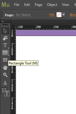
Rectangle Tool
ADD IMAGE
- To add an image to a rectangle, select the rectangle and open the Fill panel.
- In the panel, click the Add Image text button.
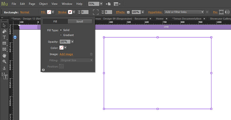
Add Images
Text Button
- In the folder dialog box, select an image and click the Open button to add it to the slider.
- The final step is to set the Fitting and Position setting accordingly.
- In this example, the image has been set to Scale to Fill and position to the center.
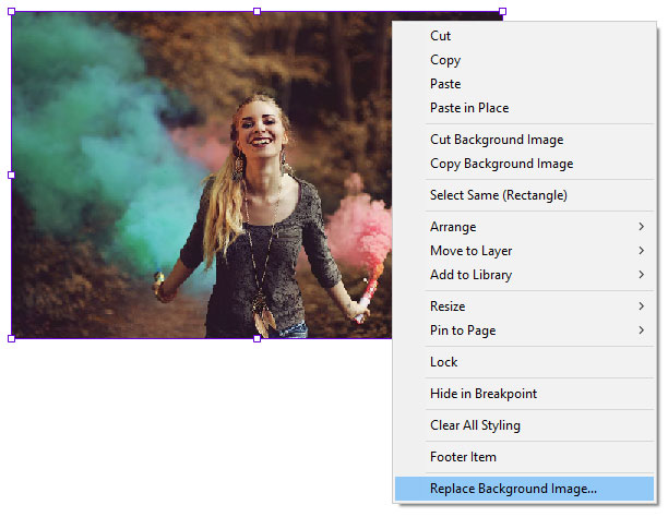
REPLACE IMAGE
- To replace the sample image, select the rectangle, right click and use the Replace Background Image to select a new image.
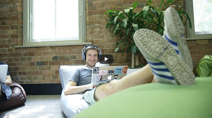
YOUTUBE & VIMEO VIDEO WIDGETS
- YouTube and Vimeo video widget are two widgets that can play videos from the YouTube and Vimeo websites respectively.
Vimeo Video Widget
YouTube Video Widget
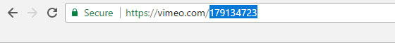
Vimeo Video Unique ID
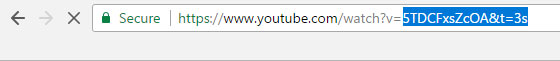
YouTube Video Unique ID
- In Muse, open the widget options panel and insert or paste the unique video ID inside the Video ID box.
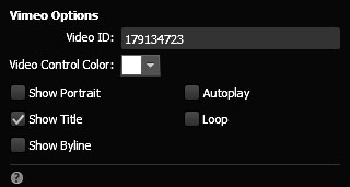
Insert/Paste Video ID
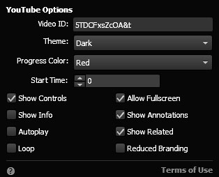
Insert/Paste Video ID
SOUNDCLOUD WIDGET
- First, go to SoundCloud website and search and select the audio that will be used and then click on the Share button.
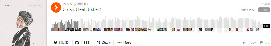
Click Share Button
- In the pop-up window, select Embed tab. Copy the code and go to the SoundCloud widget in Muse.

Select Embed
Copy Code
- Now in Muse, right click on the existing SoundCloud widget and select Edit HTML.
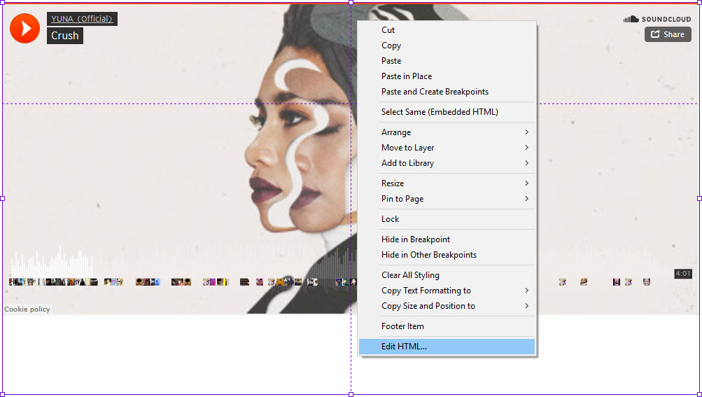
Select Command
- Replace the existing code with the new code inside the Edit HTML box.
- IMPORTANT. Delete the 'height' property in the code. The widget height will be determined by the additional styling code at the bottom of the widget code.
Delete 'Height' Property
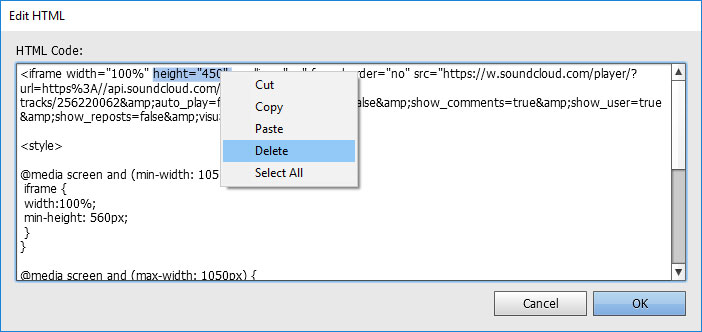
Additional Styling Code
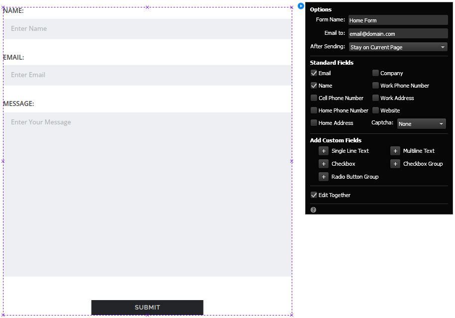
CONTACT FORM
- The contact form configuration need to be set to enable it to function.
- To do this select the contact form and open the options setting.
- Fill in a name in the 'Form Name' box and a valid email for the 'Email to' box. By doing that the contact form should be working properly.
- IMPORTANT. Make sure that the server where the website will be hosted supports PHP scripting language. If PHP is not supported or is not configured correctly, the contact form will have problem working correctly. Depending on the type of subscription, this is normally by default set up by the hosting provider. However if warning regarding PHP is received when the page loads or when the contact form is used, please contact the hosting provider and explain the problem.
- NOTE. On some templates, the contact form widget has been placed inside a State Button box. This is a workaround to enable reveal animation to be assigned to the contact form widget.
Insert a form name
Insert a valid email
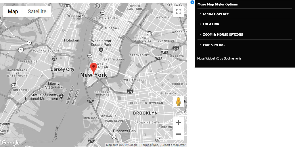
CUSTOM MAP
- A custom map styling widget has been included in the package.
- Open the widget options panel to adjust the map settings and preferences.
- Instructions are available in the options panel to help you to use the widget.
- IMPORTANT. If your map are not showing, make sure that you have created and inserted the Google API key.
All content © Tersus, 2019. All rights reserved.